

Company · Brand
The Pulsor Suite brand, ready to use.
Official Pulsor Suite logos, symbol, colours and visuals for the press, partners and customers. Download the files as they are: please do not redraw, recolour or distort them.
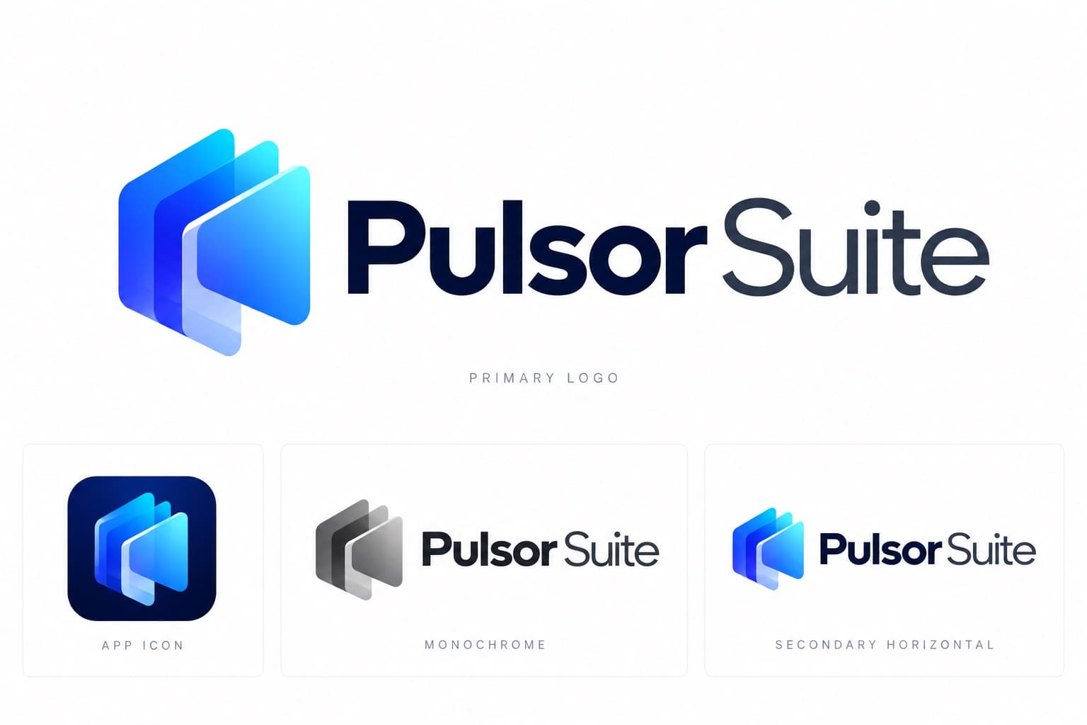
Logos and visuals
Each file comes from the official brand pack.

Primary logo
The default logo, on white or light backgrounds.



Symbol
When space is short: app icons, avatars, favicons.


Wordmark
The name alone, when the symbol is already shown nearby.

App icon and avatar
Profile pictures on social networks and stores.


White logo
On dark or photographic backgrounds.


Social banner
Header image for LinkedIn, X and other profiles.

Colours
The brand palette. Interfaces, the website and documents use the Inter typeface; the logo is always the supplied artwork, never typed.
Deep Navy
#0A1B4D
Enterprise, headings
Royal Blue
#1A56FF
Primary brand
Electric Blue
#2D9BFF
Highlights
Cyan
#27E1FF
Intelligence accent
Cool Gray
#A0A7BB
Secondary text
Charcoal
#1E293B
Body, interface
White
#FFFFFF
Space, backgrounds
Using the logo
- Keep clear space around the whole logo: at least the height of the symbol's sparkle.
- Minimum width of the full logo on screen: 120 px. Symbol alone: 16 px (32 px recommended in interfaces).
- Use the colour, black or white versions only, with enough contrast with the background.
- Do not stretch, skew or rotate the logo, change its gradient or recolour its layers.
- No shadows, outlines or effects; never retype the name with a font.
- For engraving, embroidery and signage, use the black or white vector version.
Press and partnership requests
For interviews, other file formats or co-branding, write to us.